The cyber risk dashboard: Identifying risk drivers for decision-making
Cyber risk dashboards have become a routine part of reporting to management and boards, but many still fail to deliver a meaningful view of exposure. While they highlight operational metrics or compliance scores, they provide little insight into the financial or strategic implications of cyber events.
This article examines how dashboards fall short, how measurement practices and human judgment contribute to inconsistent results, and what it takes to build dashboards that support real decision-making. It outlines the limits of common tools such as heatmaps, explains how to align metrics with risk appetite, and shows how financially grounded methods like FAIR and DDRM strengthen governance and prioritization.
- Dashboards shape decision-making by translating cyber activity into metrics executives rely on for risk oversight
- Traditional cyber dashboards can fail because they focus on compliance and control maturity rather than actual drivers of financial exposure
- Human bias, inconsistent expert judgment, and the use of heatmaps or ordinal scales undermine the reliability of many risk assessments
- Effective dashboards begin with understanding critical assets, quantifying exposure in financial terms, and aligning metrics with risk appetite
- Tailored dashboards support different audiences by highlighting the controls and actions that meaningfully reduce risk
How Cyber Risk Dashboards Shape Decision-Making
Dashboards have become the default way security leaders report to management. And somehow many fail to deliver what boards and executives actually need: a clear view of risk in business terms. Overloaded with compliance percentages and technical maturity scores, they present plenty of information but little insight into the questions that matter most.
· What is our current exposure?
· How has it changed?
· What could it cost?
As the NACD has emphasized in its Cyber-Risk Oversight Handbook, boards expect dashboards to connect cyber metrics directly to financial exposure and governance priorities, not just operational activity. When well designed, a cyber risk dashboard communicates the shared language of enterprise risk: probability, impact, financial exposure and return on investment. A good dashboard is adapted to the audience, providing operational detail for teams, program performance for CISOs, and strategic decision support for boards. By integrating financial quantification methods such as FAIR or DDRM, dashboards become tools that build trust, help prioritization, and support decisions at all levels of an organization.
Why cyber risk dashboards fall short
Cyber risk dashboards don’t usually fail because of a lack of data. They fail because they measure the wrong risks. Too many organizations fall into the trap of treating risk assessment as a compliance exercise. They perform a risk assessment, produce a score, and move on. The output might satisfy a regulatory authority, but it doesn’t tell management or senior executives what their risk exposure is in business terms or how the business can improve their resilience.
When dashboards are built with this kind of data, they can create a false sense of security. Especially when a dashboard is full of operational minutia, but nothing points to the actual drivers of risk or a recommended action.
Risk management is about decisions
Cyber risk management is often misunderstood. Too many organizations treat it as a compliance exercise: produce a report, check the boxes, and file it away. But that misses the point. Risk management is about making better decisions under uncertainty.
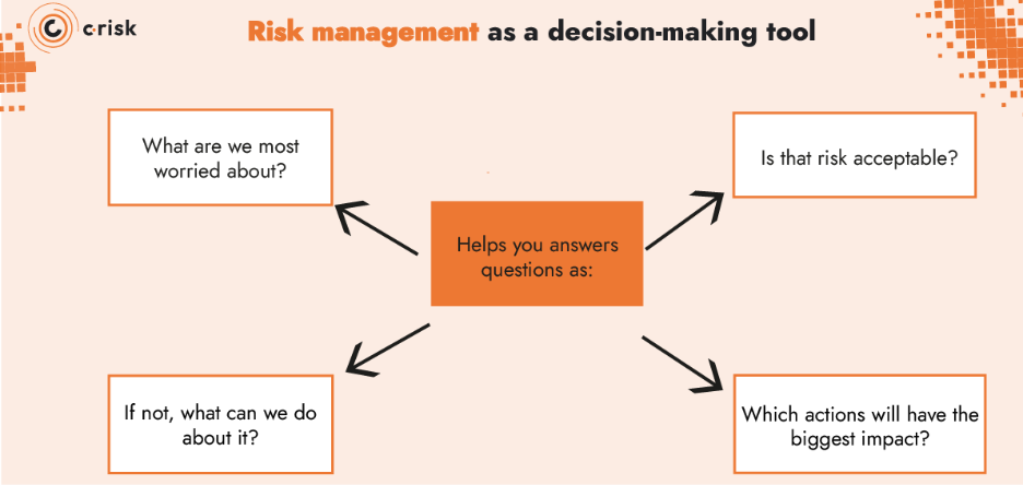
At its core, risk management is a decision-making tool. It should help you answer questions, such as:
- What are we most worried about?
- Is that risk acceptable?
- If not, what can we do about it?
- Which actions will have the biggest impact?
The mistake many businesses make is measuring the wrong things, with a focus on compliance scores or control maturity ratings that have little to do with the drivers of actual risk. This leads to dashboards full of data but lacking actionable insights. The purpose of measurement is to guide choices: where to invest, what to prioritize, and whether risk exposure is within your risk appetite.
Measuring what doesn’t matter
Take the example of an organization that doesn’t process or store any personal identifiable information (PII). The CISO dashboard reports on encryption coverage. The numbers look good, but they’re meaningless in context. Because there is no sensitive personal data to protect, it makes no difference to the company’s real exposure whether encryption is 80% or 100% deployed.
This is what happens when measurement isn’t tied to risk drivers. You end up tracking a control because it’s on a compliance checklist, not because it matters to your business. As a result, resources are wasted on measuring risk that doesn’t exist, and the results don’t support a single decision about risk appetite or investment.
Overconfidence can lead to poor decisions
Douglas W. Hubbard, an expert in decision theory and risk analysis and author of How to Measure Anything in Cybersecurity Risk, warns about what he calls the analysis placebo. This occurs when an organization adopts a new risk assessment method that is structured and formal, which leads to overconfident estimates and decisions that aren’t measurably better. In some studies, formal-looking methods even led to worse outcomes, while participants reported higher confidence.
Cybersecurity dashboards are especially prone to this effect. Traffic lights, maturity scores, or compliance percentages can give the impression of rigor without answering the most important questions: has exposure gone down, and are we closer to being within appetite?
Confidence in risk measurement should come from using methods that are transparent, repeatable, and testable. That means tracking whether the subject matter experts who supply estimates are accurate over time and helping them practice calibration techniques to improve. Just as you would test and refine any other measurement tool, you can give experts feedback, so their estimates become more reliable. By creating a feedback loop between estimates and outcomes, risk leaders build dashboards that improve decision-making and demonstrate resilience.
Human bias in risk assessments
Human judgment is inconsistent. Ask the same person to estimate risk at different times of day, or even before and after a cup of coffee, and you may get different answers. Context, framing, and even mood can shift the outcome. Hubbard’s research shows this variability isn’t random. It’s noise that undermines consistency.
The problem isn’t that bias exists, but that it’s not acknowledged in the process. When organizations assume expert opinion is objective, they bake inconsistency into their dashboards. The better approach is to recognize bias and manage it. Calibration training and structured feedback help experts see where their estimates drift, allowing that variability to be accounted for. Dashboards that acknowledge human bias are ultimately more transparent and more resilient, because they acknowledge uncertainty.
The limits of risk heatmaps and risk matrices
Heatmaps and risk matrices remain popular because they’re simple and visual. Plot likelihood against impact, color-code the boxes, and risks appear easy to compare. That simplicity explains their appeal.
But the simplicity comes at a cost. Jack Jones, creator of the FAIR model, points out that heatmaps rely on ordinal scales like “low, medium, high” that don’t capture real differences in risk. Two very different scenarios can end up in the same box, giving the impression of prioritization where none exists.
Experts also note that heatmaps are subjective. Risk placement depends on judgment rather than measurement of financial impact. This often leads to misplaced resource allocation on controls that don’t address risks that exceed the risk appetite.
What’s missing is a connection back to the questions that matter: is the risk acceptable, and if not, what actions will make the biggest difference?
How to build a cyber risk dashboard: Deciding what to measure
The starting point for any useful dashboard is simple: align metrics to the risks that matter for your organization. Risk management is a decision-making discipline, not a compliance exercise, and dashboards should reflect that.
Start with the asset
The first step is to understand the digital asset at risk you need to assess. What system, process or dataset are you concerned about? If it becomes unavailable, corrupted, or exposed, what is the business impact? Without this context, cybersecurity metrics become detached from the business and quickly lose relevance.
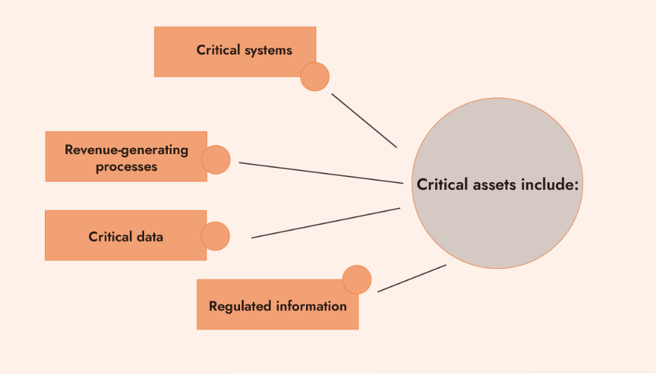
Examples of critical assets include:
- Critical systems – payment platforms, ERP or cloud infrastructure
- Revenue-generating processes – e-commerce transactions or manufacturing operations
- Critical data – customer records, intellectual property or financial reporting information
- Regulated information – personal identifiable information (PII), health records or payment card data
Define the risk in financial terms
Once the critical asset is identified, the next step is to quantify the risk. FAIR gives us a useful definition: risk is the probable frequency and probable magnitude of future loss. Governance dashboards should therefore express exposure in financial terms as a range for the most-likely financial loss and worst-case estimate.
Boards and executives think in business terms, which means financial impact. A dashboard that translates vulnerabilities and controls into potential financial loss provides a common ground for decision-making. It lets cyber risk be compared alongside other business risks and investment priorities. The NACD makes this point explicitly: board discussions should include the identification and quantification of financial exposure, and decisions on whether to accept, mitigate, or transfer cyber risk.
Communicating risk appetite
Risk appetite is set by the board or executive leadership. When reporting on cyber risk, it is important to clearly demonstrate how current risk exposure measures up to the risk appetite and what options exist if exposure exceeds the appetite. Without acknowledging the appetite, a risk analysis has no reference point, and dashboards end up presenting numbers without context for decisions.
There is a simple logic to follow when establishing where or not a risk exceed appetite:
- First: Is the risk within appetite?
- If yes → that’s the conclusion. Move on.
- If no → the dashboard needs to show what comes next.
- Next: What controls matter in the context of this scenario?
- Then: Which of those controls will have a meaningful impact on reducing the risk?
That’s where the focus should be. Appetite provides the reference point, and the dashboard connects it to specific actions or controls that change exposure.
Identify the controls that matter
When exposure is outside appetite, the goal is not to produce a long list of potential controls. Many dashboards end up doing just that, and it creates noise. The task is simpler: focus on the controls that will have a meaningful impact on the risk scenario.
Take the example of backup recovery:
- Scenario: A major incident could cost up to $500,000.
- Risk appetite: $400,000. Exposure is outside tolerance.
- Driver of loss: Recovery time of seven days
- Control that matters: Backup and recovery maturity
- Recommended Action: Improve backup recovery to reduce downtime
- Result: Potential loss drops from $500,000 to $300,000
This is the kind of actionable output that delivers clear recommendations for prioritization in line with risk appetite. It highlights the control gap, shows which control reduces the financial loss magnitude, and demonstrates how that action brings risk back within appetite.
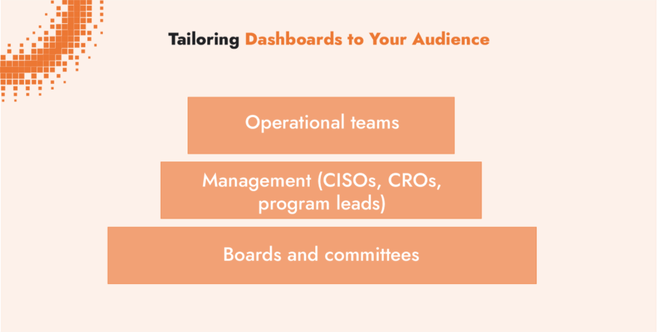
Tailoring dashboards to your audience
At every level, the principle is the same: align the dashboard to the decision. Operators decide which tasks to tackle now. CISOs decide which projects to fund and how to steer the program. Boards decide whether to accept risk, demand more action, or approve investment. An actionable dashboard will support the decision that is under consideration.
Operational teams
- Patching efficacy (how quickly and consistently vulnerabilities are fixed)
- Phishing click-through rates (number of users clicked on simulated or real phishing emails)
- Incident response times (how fast issues are detected and contained)
Management (CISOs, CROs, program leads)
- Scenario-based exposure (financial impact of specific risk scenarios)
- Status of open actions on key controls (e.g. backup and recovery maturity)
- Program performance metrics (Are projects reducing exposure as planned?)
- Trends in exposure over time (is risk posture improving or slipping?)
Boards and committees
- Current risk exposure in financial terms (e.g. “losses could reach $300K”)
- Comparison of exposure to risk appetite (inside or outside tolerance)
- Cost of action vs. reduction in exposure (e.g. “$20K investment lowers exposure from $300K to $200K”)
- Long-term trends and external drivers (e.g. rising phishing sophistication increasing exposure year over year)
Dashboard metrics should always align with the decision in front of the audience.
Integrated decision support for executives
An effective dashboard is not a compliance scorecard. It is a decision-support tool. At the governance level, that means presenting risk in business and financial terms, showing exposure against appetite, and highlighting the few controls that meaningfully influence outcomes.
The value of a cyber risk governance dashboard lies in its ability to provide context and direction. Executives should be able to see clearly whether a risk is within appetite. This shifts the focus from broad lists of control gaps to the initiatives that deliver measurable risk reduction.
From theory to practice: building dashboards that drive decisions
Cyber risk management requires rigorous methods and data to connect cyber risk to business outcomes. Too often, dashboards are used as operational scorecards, leaving executives without the insight they need to make informed decisions.
At C-Risk, we apply Data-Driven Risk Management (DDRM) and Cyber Risk Quantification (CRQ) using the FAIR standard to build meaningful reports for risk leaders and executives. Our analysis methods enable prioritization, guide budget allocation and demonstrate cyber resilience. Our work with clients covers a range of use cases, including:
- Communicating cyber risk to the board using financial terms aligned with appetite
- Identifying top risks and prioritizing controls that deliver the greatest measurable reduction in exposure
- Optimizing cyber insurance coverage with quantified scenarios that ensures coverages matches exposure
- Meeting regulatory requirements such as DORA, NIS 2 or SEC rules with risk-based cyber risk management support
- DDRM training courses for executives and risk professions to build internal cyber risk management capacity